Yale School of Art
Website Redesign Project
Overview
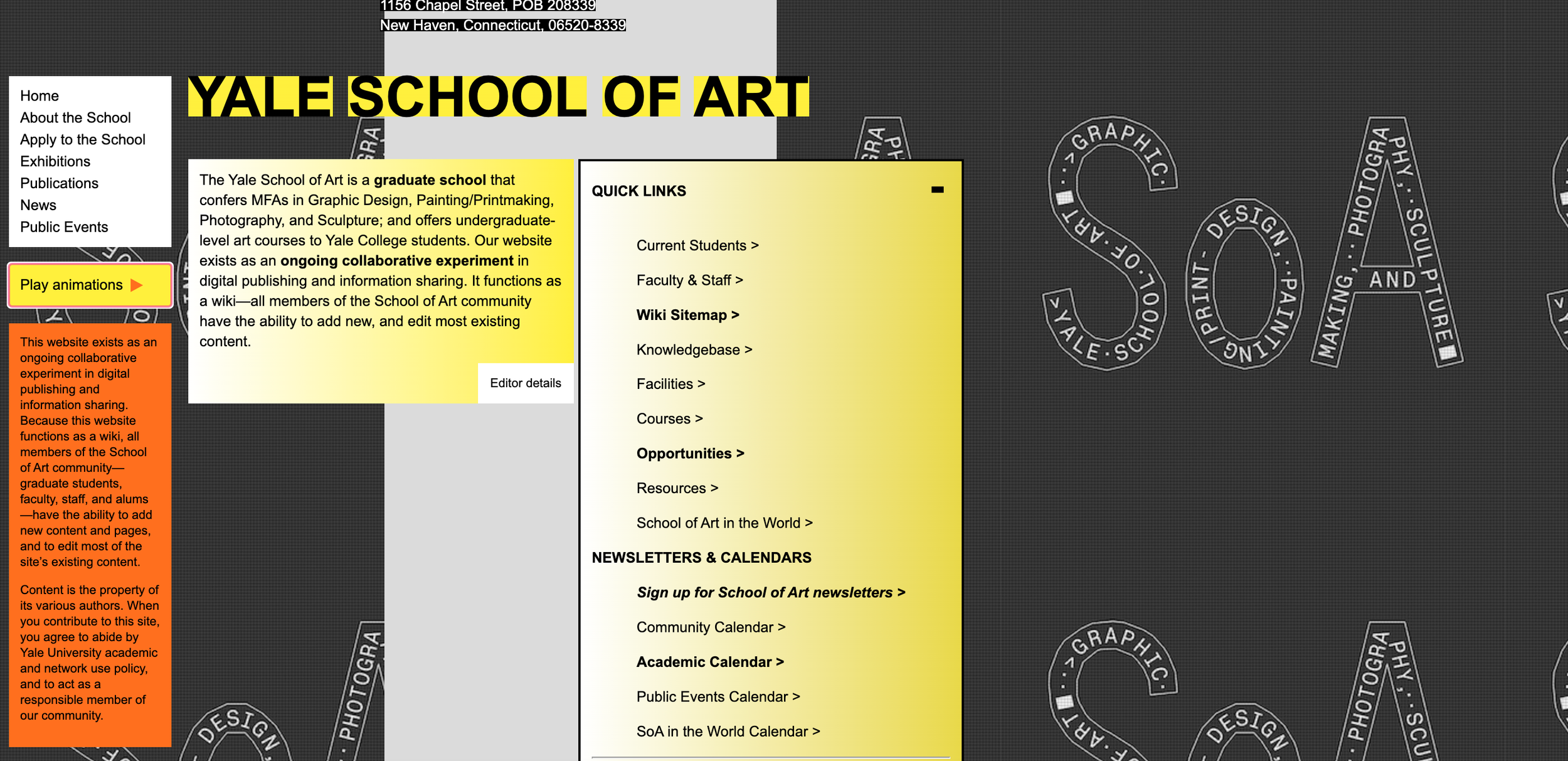
The Yale School of Art created this page to present information to potential applicants for the school, as well as people that want to come enjoy the exhibits. This website is a wiki, which allows all students and faculty to update and change the page as needed. While this concept itself has a lot of potential, it has ultimately created a page with little organization.
The navigation within this website is ultimately very confusing. The homepage instantly grabs your attention by using moving digital images for the background, as well as using a combination of low-contrast colors within the text. This page houses information including a community bulletin, short description of the school, an event schedule, as well as lists with 20 “quicklinks”. By giving the user this many options, it is easy for them to quickly feel very intimidated, which may ultimately lead to unsatisfied viewers, less applicants, and less visitors. Because of this, my goals within this project are;
Simplify the navigation - Organize the information in a friendlier way - Create a visually pleasing design
Disclaimer: This project is a theoretical redesign, and is not affiliated with Yale University.
Current Outcome
With the current design, first-time-users are quickly intimidated by the amount of choices that they are given. Even after navigating through a few pages I quickly noticed that there is similar information being housed on several pages creating repetition and a lack of credibility. The ultimate outcome of the lack of organization on this site is confusion and intimidation.
Desired Outcome
As inclusion being my biggest goal within design, I hope to create a visually pleasing site that includes all necessary information for potential applicants and visitors. I strive to be intentional with the online space I create to allow all users to feel a sense of belonging on the site and at the school.
User Journey
By understanding your potential users, you can create a clearer vision of what you hope to create. Understanding their knowledge level, needs, struggles, and frustrations will ultimately allow me to create an accessible and efficient design.
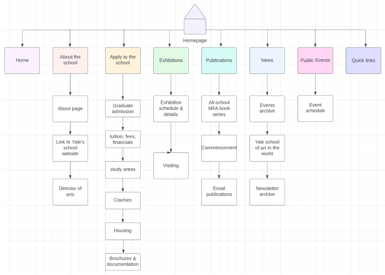
For this portion of the project, I conducted a user test using card sorting. First, I visited Yale’s School of Art website. I took note of the way that they have their information formatted, as well as the banners, and links. I wanted to keep the information that the site already offers, so that new visitors can find all of the information that is already on the site. I wrote all 8 of the topics, as well as the links underneath the topics on to note cards. In total I had 26 note cards. The video said to have less than 40 cards so I felt good about this amount. I then had my roommate, Jada, sit down and participate in a card sorting. I told her to group them however she sees fit, and I wasn’t entirely surprised by the outcome, but there were a few things I noticed and found interesting. When she initially started, she didn’t look through them beforehand. She would take the card on top and place it in a different area on the counter. After about half of the cards, she had many piles consisting of only a few cards. She would group together with similar words, such as events archive and event schedule. Once she went through all 26 cards the first time, she then gathered them all back up and started organizing in a way that made much more sense to me. She would find the cards with words that seemed to be headers, such as; “About the School”, “Apply to the School” and “Quick Links”. This time around, instead of stacking all of the cards, she would place the headers at the top, and then the subtopics underneath. One thing that I found especially interesting, is that after she placed all of the cards, she went back through them one more time. This time, she alphabetized all of them. The headers first, and then all of the subtopics underneath. This was very interesting to me and gave me more ideas on how to better organize this information. Ultimately I found this entire process to be very helpful and enlightening. It really showed me just how different we really all are, and how important it is to test users to create a better understanding of what works for different types of people.
Building a Wireframe
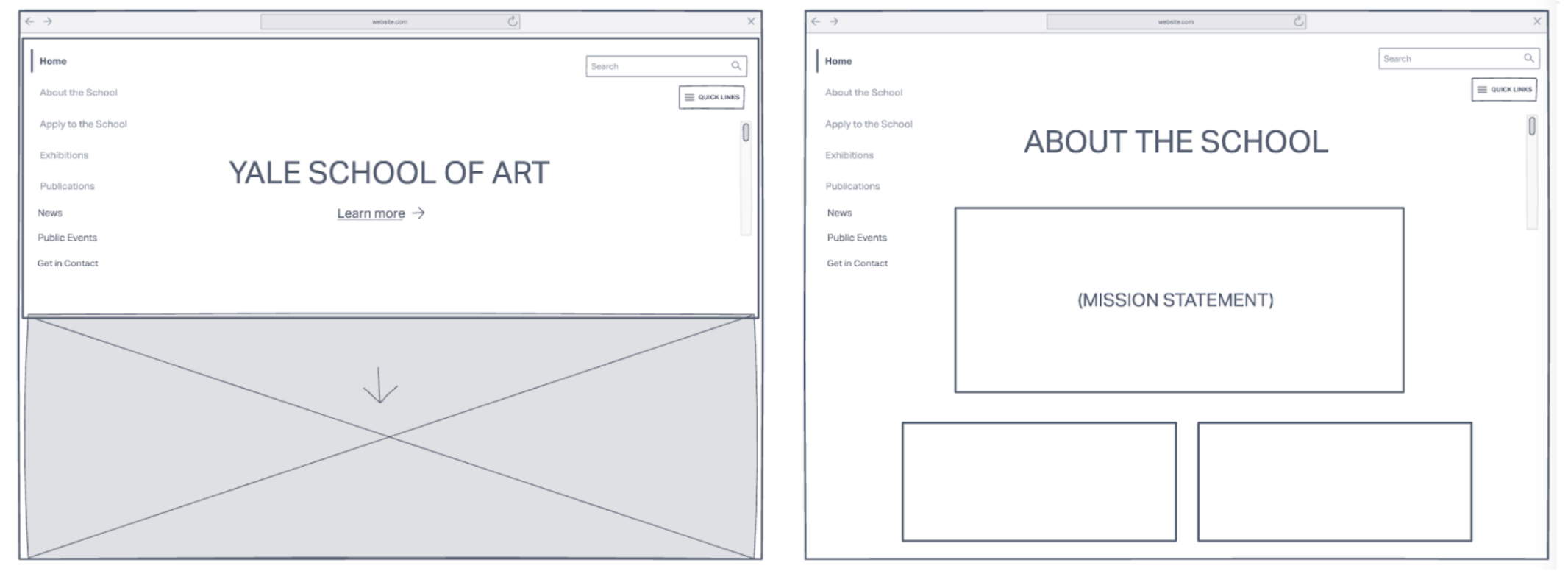
To create my wireframe I used figma. I really enjoyed creating this wireframe as it allowed me to visualize how my design would ultimately turn out. I played around with the format and organization of the information and images and eventually found a design that I was excited to start working on.
Low Fidelity Prototype
After creating my wireframe I used the feedback I gained in the user test to move on to my first prototype. My goal with the first prototype was to create a simple map and navigation to house all of my design and information. I created a very simple format so that the options were endless when adding the text and images.
Link to interactive prototype here>
Design Choices
As for the visual design choices including a color palette and icons, I decided to use a color scheme that felt playful by using pinks and greens. I thought that these colors left room for a lot of creativity when coming to making the actual design. For the icons I used very simple icons with rounded edges to keep the design very simple yet artistic.
Link to Final Design>
What I Learned
Throughout the entire redesign process I found myself really pushing my typical limits and challenging myself. I ultimately really enjoyed visually reconfiguring a site that has a lot of potential all while improving the useability. I improved my skills in Adobe XD, Figma, as well as my user testing skills. I am very happy with the outcome and hope to continue to have an eye out for processes that can be improved.


Yale School of Art Website Redesign Project
It all begins with an idea.
It all begins with an idea. Maybe you want to launch a business. Maybe you want to turn a hobby into something more. Or maybe you have a creative project to share with the world. Whatever it is, the way you tell your story online can make all the difference.
Don’t worry about sounding professional. Sound like you. There are over 1.5 billion websites out there, but your story is what’s going to separate this one from the rest. If you read the words back and don’t hear your own voice in your head, that’s a good sign you still have more work to do.
Be clear, be confident and don’t overthink it. The beauty of your story is that it’s going to continue to evolve and your site can evolve with it. Your goal should be to make it feel right for right now. Later will take care of itself. It always does.